Performance Scorecard
 Updated
by
Arianne G.
Updated
by
Arianne G.
- Access Performance Scorecard
- Category scores
- Thresholds
- Map view
- Filters
- Tree Map view
- Ranking table
- Metrics table
The Performance Scorecard provides a quick view of individual and company performance in the following areas: Cycle Time, Estimate Quality, Price List Changes, and Reinspection.
The screen shots in this document are generic, and your company’s interface may vary.
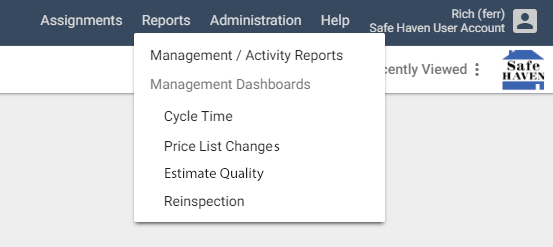
Access Performance Scorecard
The Performance Scorecard is only available in XactAnalysis SP if a carrier company grants access to it.
- In XactAnalysis, click the Reports menu.
- Select one of the four Performance Scorecard metric categories: Cycle Time, Price List Changes, Estimate Quality, or Reinspection. The scorecard opens in a new tab.
Category scores
The overall scores for each of the metric categories are listed across the top of the scorecard (Cycle Time, Price List Changes, Estimate Quality, and Reinspection). The Overall score for your company is also displayed. It consists of the average of the four category scores.
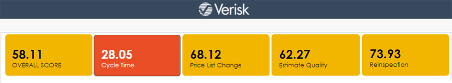
- The color surrounding each score represents its threshold status.
- You can click any of the category score boxes to view the scorecard for that category.
Thresholds
The scorecard can help you quickly identify above average scores or unacceptable scores with thresholds. Thresholds are a group of three score ranges. The ranges are designated as green (above compliance), yellow (compliant), or red (below compliance). When a score falls within any of these ranges, it is represented on the scorecard (numbers or objects) with that color.
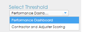
Select a threshold
If you have multiple thresholds, you can select one of them from the Select Threshold menu on the left side of the scorecard. The scorecard automatically updates itself to reflect the selected threshold.
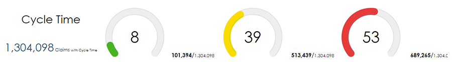
Threshold gauges
Near the scorecard name, you’ll find the total number of claims with data for your selected category. There are also three threshold gauges. The gauges represent the percentage of claims that fell within the green, yellow, and red thresholds.
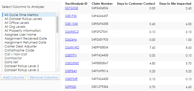
List view
You can click the total number of claims, the total number of claims with category data, or the total number of claims in each threshold to view an interactive list of the claims that comprise that total.
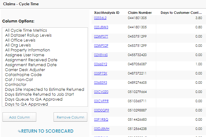
- You can click a claim’s XactAnalysis ID to open the claim in XactAnalysis.
- You can add or remove columns from this view by selecting the column name from the Column Options box and clicking Add Column or Remove Column.
- You can click any of the column headers to sort the list by that column in ascending or descending order.
- To exit List View, click Return to Scorecard.
Map view
The map displayed in the scorecard is interactive. You can click any of the states in the map to instantly filter the scorecard by that state. You can also select states or subset areas from Drill-down Filters.
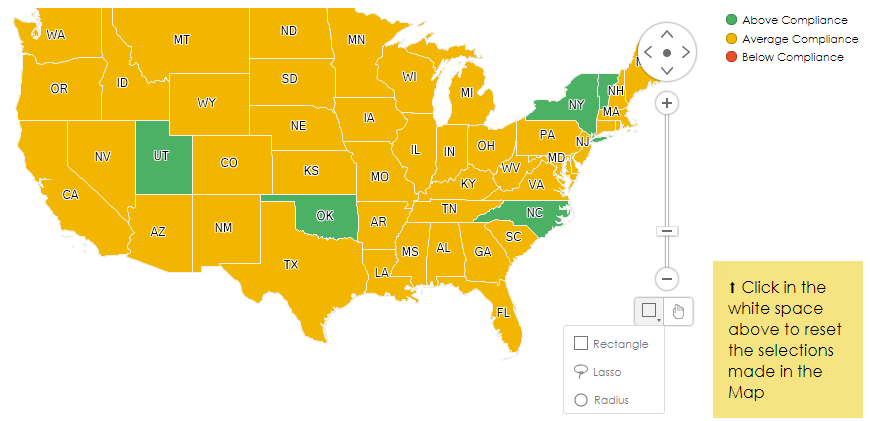
- You can move the map in any direction or zoom in and out with the tools on the right side of the map.
- You can select multiple states with the Rectangle, Lasso, or Radius tools (see image above).
- The Rectangle tool allows you to click and drag a rectangular shape over the map. Any states within the boundary of the shape are selected.
- The Lasso tool allows you to draw a custom shape on the map. Any states within the boundary of the shape are selected.
- The Radius tool allows you to click and drag a circular shape over the map. Any states within the boundary of the shape are selected.
- To de-select a state, click anywhere in the white space immediately surrounding the map.
Filters
The filter sections allow you to instantly alter the scorecard and search for specific information. Click any of the filter headers on the left side of the scorecard to expand or collapse the section. To reset all the filters to their default states, click Reset Filters near the top of the scorecard.
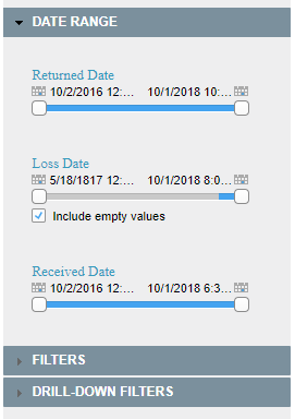
Date Range section
The Date Range section allows you to filter the scorecard by claims with any combination of Returned, Loss, or Received date ranges.
- To change the start or end date for a filter, click and drag the corresponding box on either end of the filter until the desired date is displayed above it.
- When the Include Empty Values check box is selected, claims with no status are included in the filter.
Filters section
The Filters section allows you to filter the scorecard by claims that fall within a specified monetary amount and have certain claim attributes.
- To change the start or end date for the Claim Amount filter, click and drag the corresponding box on either end of the filter until the desired amount is displayed above it.
- To filter the scorecard by a data set, company, person, or other claim attribute, select an option from one of the filter boxes. The other filter boxes will automatically update accordingly.
- You can select multiple options in a filter by holding the Ctrl or Cmd button on your keyboard while you click each option.
Drill-down Filters section
The Drill-down Filters section allows you to filter the scorecard by your company’s hierarchies.
- To filter the scorecard by a specific geographic area, office level, or organization level, select the level’s name in any of the filter boxes. You can also use the search fields above the filter boxes to find a specific option.
- You can select multiple options in a filter by holding the Ctrl or Cmd button on your keyboard while you click each option.
- To filter the scorecard by data sets, select or de-select the data set check boxes in the Dataset Rollup Levels filter. You can click the “+” or “-“ icons next to each data set to expand or collapse the various subsets within it. You can also click the View Levels icon in the filter’s search bar to select a level of the hierarchy to expand.
Tree Map view
Click the Tree Map button next to the map to open the Tree Map view of the scorecard. This view allows you to organize and graphically view your company’s claims with four selectable levels.
To organize this view, select claim attributes from the Level menus. Level 1 is the most general and Level 4 is the most specific. Levels 1–3 appear graphically as grey headers. Level 4 appears graphically as colored boxes.
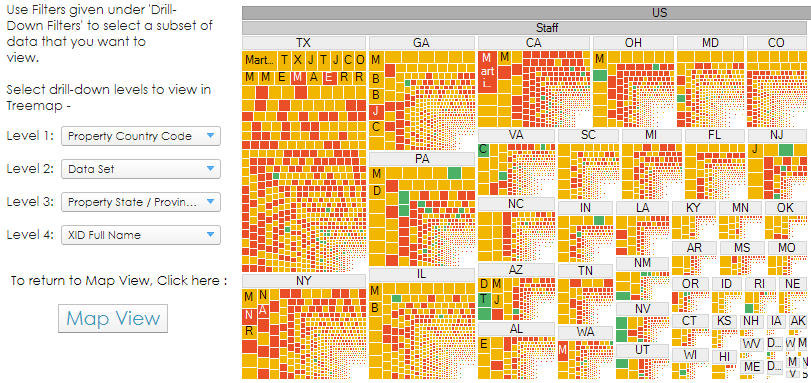
- The size of the boxes represents the number of claims associated with it. They’re ordered from largest to smallest.
- The color of each box represents its threshold status.
- You can click a header or a box to drill down to that level.
- You can hover your cursor over each box to see its level data, overall score, and the number of claims associated with it.
- The individual claims from the selected level are displayed in a table at the bottom of the view. You can select which columns appear in the table by selecting their names from the filter to the left of the table and clicking Add Columns or Remove Columns.
- You can click a claim’s XactAnalysis ID in the table to open it in XactAnalysis.
- You can click the Map View button to return to the map view.
Ranking table
The Ranking table is located to the right of the map view. This table ranks the overall scores of individuals, companies, or data sets involved with your claims.
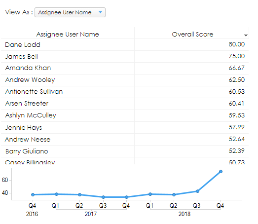
- You can change the subject of the table by selecting an option from the View As menu. The ranking table and the metrics table at the bottom of the scorecard update themselves to reflect your selection.
Carrier Desk Adjuster
Rank the overall scores of carrier desk adjusters.
Assignee User Name
Rank the overall scores of claim assignees.
Claim Number
Rank the overall scores of individual claims.
Contractor
Rank the overall scores of contractors.
Data Set
Rank the overall scores of your company’s data sets.
- You can sort the claims in ascending or descending order by clicking the Overall Score header and selecting the Sort Ascending or Sort Descending icons.
- The graph at the bottom of the table updates itself with your selections and displays the average overall scores from the last nine quarters.
Metrics table
Metrics are the measurable attributes used to calculate the overall scores in each scorecard. Each category has its own metrics and they are displayed in a table across the bottom of the scorecard.
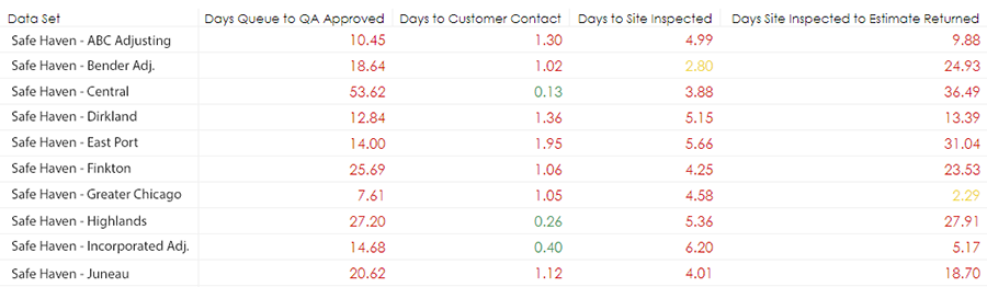
- The subject of the table (individuals, groups, or data sets) is determined by the View As menu in the ranking table.
- The color of each metric score represents its threshold status.
- You can click any of the headers in the table to organize the table according to that column.
Cycle Time metrics
Days in Queue to QA Approved
The number of days between the time an assignment enters the queue and the time it is updated as QA Approved.
Days to Customer Contact
The number of days between the time an assignment is created and the time it is updated as Customer Contacted.
Days to Site Inspected
The number of days between the time an assignment is created and the time it is updated as Site Inspected.
Days Site Inspected to Estimate Returned
The number of days between the time an assignment is updated as Site Inspected and the time the assignment is returned to XactAnalysis.
Days Estimate Returned to Job Start
The number of days between the time an assignment is returned to XactAnalysis and the time it is updated as Job Started.
Days to QA Approved
The number of days between the time an assignment is created and the time it is updated as QA Approved.
Price List Changes metrics
Estimate Deviation Percent
The Percent difference between pricelist amount and the estimate amount.
Line Items with Any Changes
The average number of items per estimate with any price list variation (meaning at least one of the following changes occurred: price, description, or unit).
Line Items with Price Changes
The average number of items per estimate with a price change.
Line Items with Unit Changes
The average number of items per estimate with a unit change.
Percent Estimates with Price Deviation
The percent of estimates with a price deviation.
Estimate Quality metrics
Claims with Estimate Corrections
The percent of estimates with corrections made to them.
Percent Estimates with Results
The percent of estimates changed before upload (after Xactimate inspection).
Estimates with Overhead and Profit
The percent of estimates with overhead or profit applied to them.
Estimates with Depreciation
The percent of estimates with depreciation applied to them.
Estimates with Inspection Findings
The percent of estimates with inspection findings (broken rules).
Reinspection metrics
Deviation Percent
The percent deviation from the estimate and the reinspection.
Effective Reinspection
The percent of estimates with an effective reinspection form.
Reinspection Overwrites
The average number of overwrites per reinspection.
Reinspection Underwrites
The average number of underwrites per reinspection.
Form Score
The percent of reinspections with form scores.
Reinspection Response
The average reinspection response time in days.
Score calculation
The following examples demonstrate how metric, category, and overall scores are calculated.
Metric scores
A metric is a measurable attribute associated with an assignment. The metric scores displayed in the scorecard represent the average value from all of the assignments that fall within your filter parameters.
For example, in the Cycle Time category, all of the Days Estimate Returned to Job Started metric values (number of days) from each assignment are added together and averaged. The resulting metric score represents the average number of days between the time an assignment is returned and when it is updated as Job Started.
Metric | Average Value |
Days Estimate Returned to Job Started | 21.01 |
Days In-Queue to QA Approved | 4.32 |
Days Site Inspected to Estimate Returned | 11.1 |
Days to QA Approved | 8.1 |
Days to Customer Contacted | 2.1 |
Category scores
- The metric scores are first assigned grades (or colors) based on your selected threshold. The table below continues the Cycle Time example and displays sample thresholds.
Metric | Average Value | Threshold |
Days Estimate Returned to Job Started | 21.01 | >= 25 is Red, 25-20 is Yellow, < 20 is green |
Days In-Queue to QA Approved | 4.32 | >= 10 is Red, 10-5 is Yellow, < 5 is green |
Days Site Inspected to Estimate Returned | 11.1 | >= 15 is Red, 15-10 is Yellow, < 10 is green |
Days to QA Approved | 8.1 | >=5 is Red, 5-2 is Yellow, < 2 is green |
Days to Customer Contacted | 8.1 | >=2 is Red, < 2 is green (no yellow) |
- The grades are then converted to a 100-based scale for calculation purposes. Weights are also assigned to each metric. These weights are designated by the carrier.
Metric | Grade | 100-based Scale Conversion | Weight |
Days Estimate Returned to Job Started | Yellow | 50 | 5 |
Days In-Queue to QA Approved | Green | 100 | 1 |
Days Site Inspected to Estimate Returned | Yellow | 50 | 5 |
Days to QA Approved | Red | 0 | 1 |
Days to Customer Contacted | Red | 0 | 5 |
- Each 100-based scale conversion is multiplied by its metric’s weight. Then the products are added together. The weights are also added together:
100-based Scale Conversion | Weight | Product |
50 | 5 | = 250 |
100 | 1 | = 100 |
50 | 5 | = 250 |
0 | 1 | = 0 |
0 | 5 | = 0 |
Sum: | 17 | 650 |
- The product sum is then divided by the weight sum to determine the Cycle Time Category score. This score receives a Yellow grade (average compliance) based on the threshold settings (>= 75 is green, 75-25 is Yellow and < 25 is red).
650 / 17 = 38.23
Overall scores
To calculate the overall score of all categories, suppose the category scores and weights are as follows:
Category | Score | Weight |
Price List Changes | 80.22 | 3 |
Estimate Quality | 75.00 | 3 |
Cycle Time | 46.42 | 2 |
Reinspection | 50.00 | 1 |
First, each category score is multiplied by its weight. Weights are designated by the carrier.
Then the products are added together. The weights are also added together:
Score | Weight | Product |
80.22 | 3 | = 240.66 |
75.00 | 3 | = 225.00 |
46.42 | 2 | = 92.84 |
50.00 | 1 | = 50.00 |
Sum: | 9 | 608.5 |
The product sum is then divided by the weight sum to determine the overall score. The example score receives a Yellow grade based on the threshold settings (>= 75 is green, 75-25 is Yellow and < 25 is red):
608.50 / 9 = 67.61